A picture is worth a thousand words, and in the world of web, a picture simply generates more engagement.
This past week, I was introduced to Canva, an online design resource company based in Australia. I was especially excited to read that Former Chief Evangelist of Apple, Guy Kawasaki, joined the ranks of this Canva and had this to say:
“Macintosh democratized computers; Google democratized information; and eBay democratized commerce. In the same way, Canva democratizes design.” said Mr. Kawasaki. “You don’t get many chances to democratize an industry, so I seized the opportunity to work for Canva.”
Sure, there are other resources out there (Photoshop, GIMP, PicMonkey or Pixlr.com), but once you have your hand on these sites, now what?
While Canva has done a great job for creating a user-friendly way of putting together a design, there are still some fundamentals to consider and learn about. Here are some basic tips and background knowledge that might help you navigate your way into creating your own social media posts:
Am I Designing for Print or Web?
Believe it not, there is a world of difference between deciding to design for print or web. Web resolution is much smaller than print 72 dots-per-inch (dpi) (instead of 300 dpi). Also, you will be working in RGB mode (red, green, blue) (instead of CMYK, cyan, magenta, yellow, and black respectively).
The Psychology of Color.
Believe it not, color plays a big role in the world of advertising. Think about all the restaurants that use the color red, a color intended to stimulate the appetite. McDonald's, Pizza Hut, and KFC are just a few among many. Here is a helpful infographic on colors used in daily life, whether it's in the home to marketing. In deciding what colors to use, try to stick with a simple color scheme. I've used Kuler over the years to help me with finding just the right color combos.
Fun with Fonts.
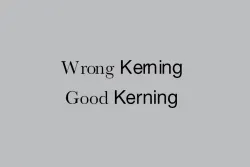
With all the font options out there, remember to keep it simple and just like you will limit your color palette, limit your font choices to 1 or 2 per post. Also, on the importance of kerning. Kerning is basically a design element where you need to consider the spacing between letters. Google recently made a minor change to their logo that you might miss if you blink, but it has to do with kerning. You may think that was not necessary, but many companies (some very well-known) have failed in the kerning department, causing confusion or embarrassment. Don't make the costly mistake of overlooking the kerning on your design!

