You get an email back from the printers mentioning the words CMYK, 300 dpi, and higher resolution. Okay... so you pulled something from the web and submitted something that didn't quite fit their standards. That's understandable. You're speaking two different languages. Take a look at this list and you'll be more prepared next time.
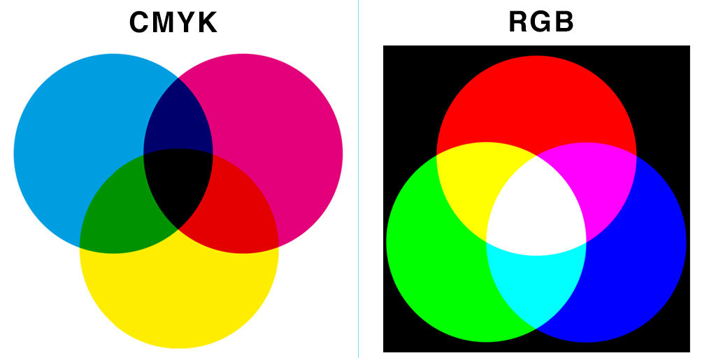
1. CMYK / RGB: Two different kinds of color modes used for print or web. CMYK stands for Cyan, Magenta, Yellow and Key (Black). Used for print, CMYK is the most common full color printing process. Digital pieces must be converted to CMYK in order to print. In contrast, RGB stands for Red, Green Blue, and are the colors emitted by your screen.
2. PPI / DPI: Images can be measured by PPI (pixels per inch) for web or DPI (dots per inch) for print. Generally, 72 PPI is best for web and 300 DPI is best for print. The more pixels you have per inch, the higher the quality.
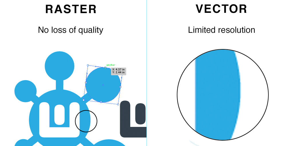
3. Raster / Vector Graphic: The difference is how you'll use these graphics. Raster images are made of pixels or dots and the formats include GIF, JPG, PNG and TIFF. Quality is lost and become pixelated if you try to expand the picture. Compare that to vector, which is best for scalable pieces. There's math involved and you usually create vector images in Adobe Illustrator. File formats can include PDF, EPS and SVF.
4. Rasterize: When you rasterize an image, you take a vector based image and convert it into a bitmapped, pixel based image.
5. JPG / GIF: When do you use which file type? JPG or JPEG (Joint Photographic Experts Group), is a common file type for photos and other digital graphics. Quality is lost as the file size decreases. GIF (Graphics Interchange Format) is commonly used for logos and limited to 256 colors. EPS (Encapsulated Postscript) is a file extension used for vector-based images.
6. Resolution: The number of pixels contained in an image. The higher the number of pixels, the higher the quality of your image. If your designer asks for a high resolution image for print, you should provide them with 300 DPI.
7. Royalty-free images: Images you purchase for a fee and can be used repeatedly in any work without any additional fees as long as you follow the license agreement. Examples of sites include: www.istockphoto.com, www.shutterstock.com, and www.gettyimages.com
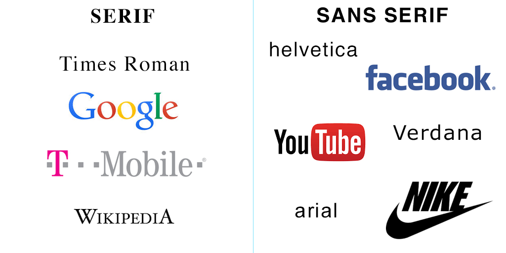
8. Serif / Sans serif: In typography, sans serif is a style of typeface "without feet." You'll notice logos like Facebook, YouTube and Nike have sans serif fonts. Common examples of fonts include Helvetica, Arial, and Verdana. Times Roman is the most known serif font. Google, T-Mobile, & Wikipedia use serif fonts.
9. Wireframe: Used in web design as a visual representation of how your website will look like. It allows clients to view the layout and content of their website before it is broken out into code.
10. Front-End: The look and feel part of the website the client can see and interact with. (Compared to back end development: programming, database, server etc.)